Portfolio
branding
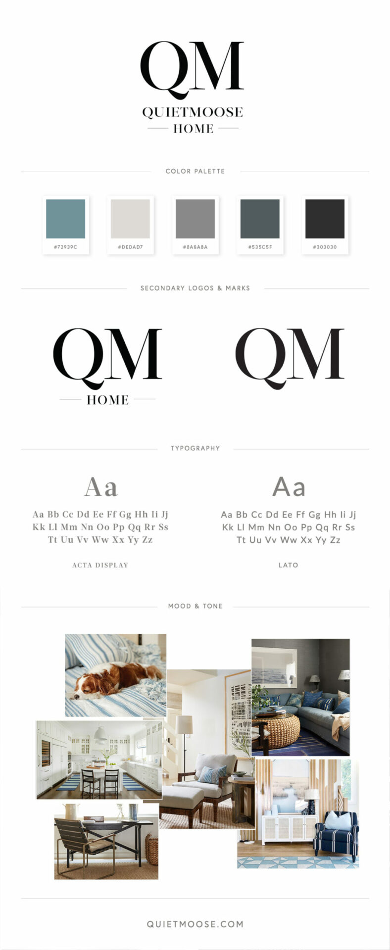
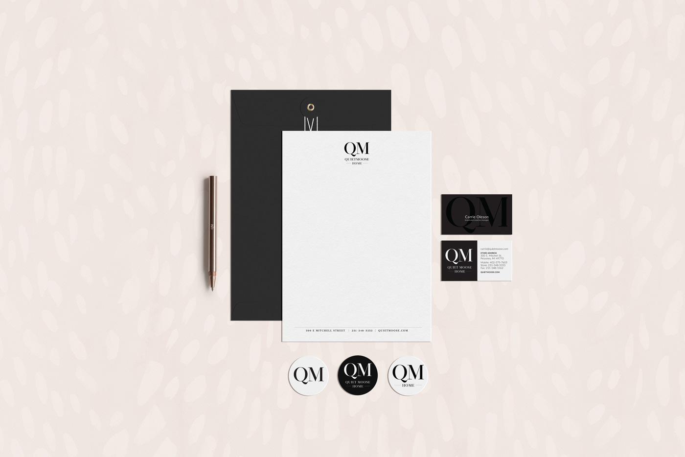
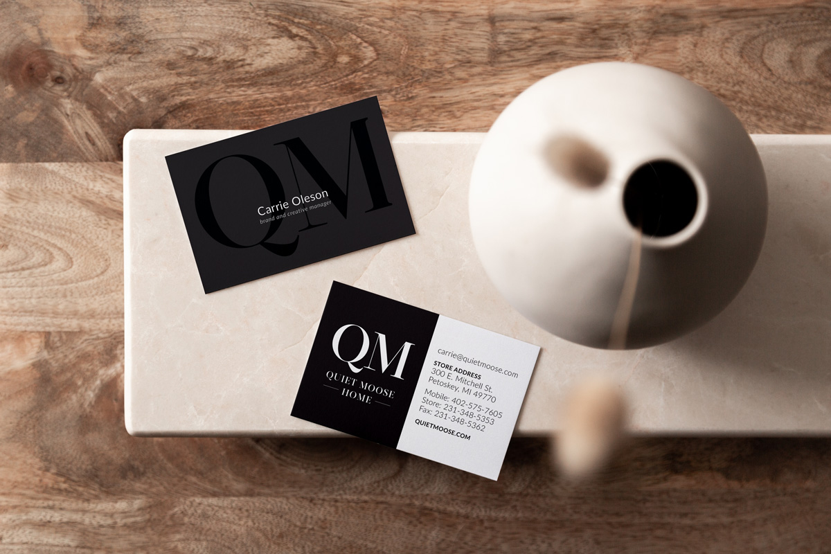
The Quiet Moose was looking for a new brand identity and we transitioned them from ‘The Quiet Moose’ to ‘QM Home’. It was important that their logotype felt polished and modern — just like their designs. This is why we went with a custom logotype that included a modern take on traditional serif type, with a custom ‘Q’ for added character. We helped them define and distill their inherent vision and translate it into practical pieces for their business.
The Quiet Moose
Branding
